Heirloom Herbal Tea is a sustainable tea brand. Their primary focus is regionally-sourced, high-quality, sustainably-farmed teas. I developed a full brand identity including logo, stationery, packaging, and a full brand guide.
T H E L O G O
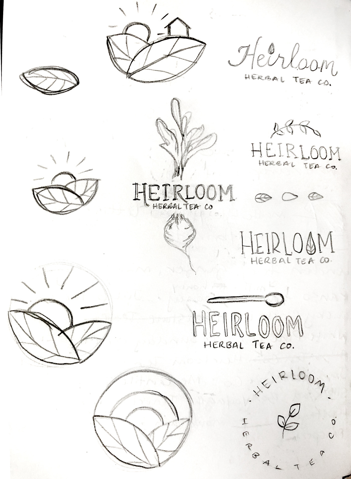
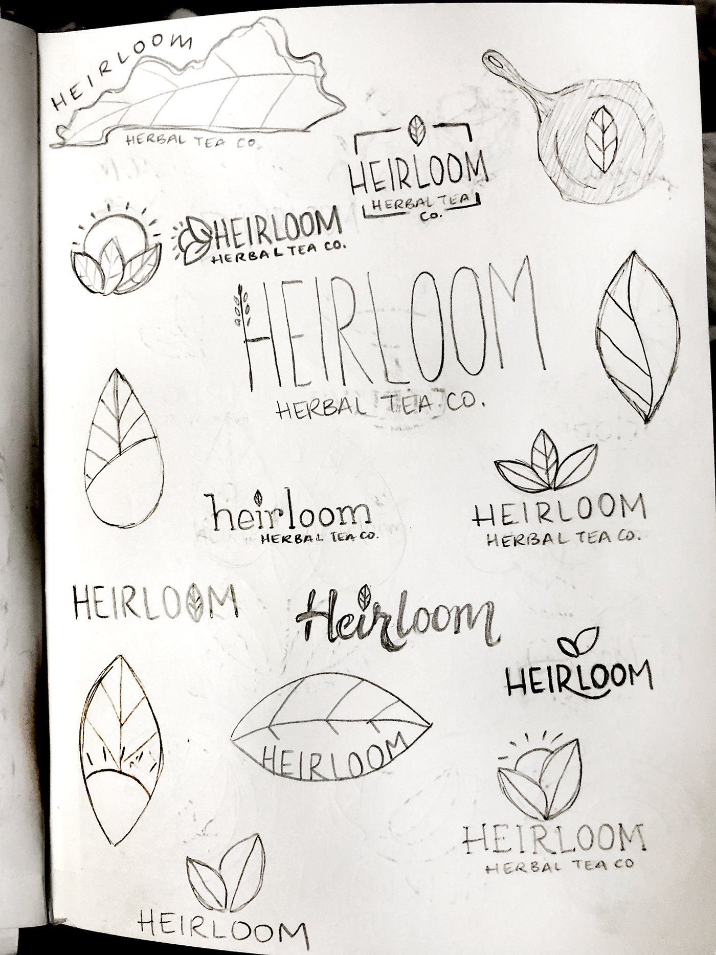
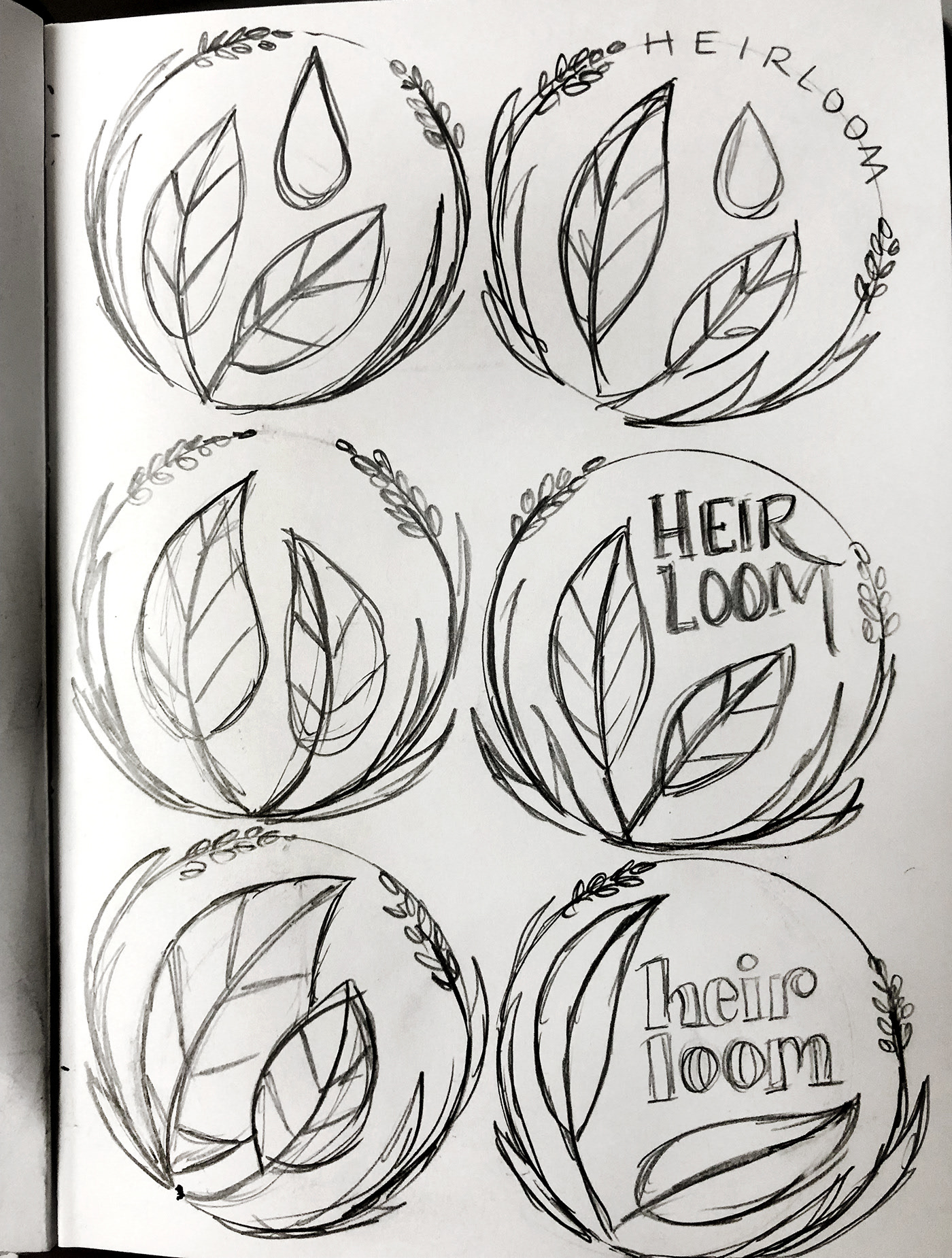
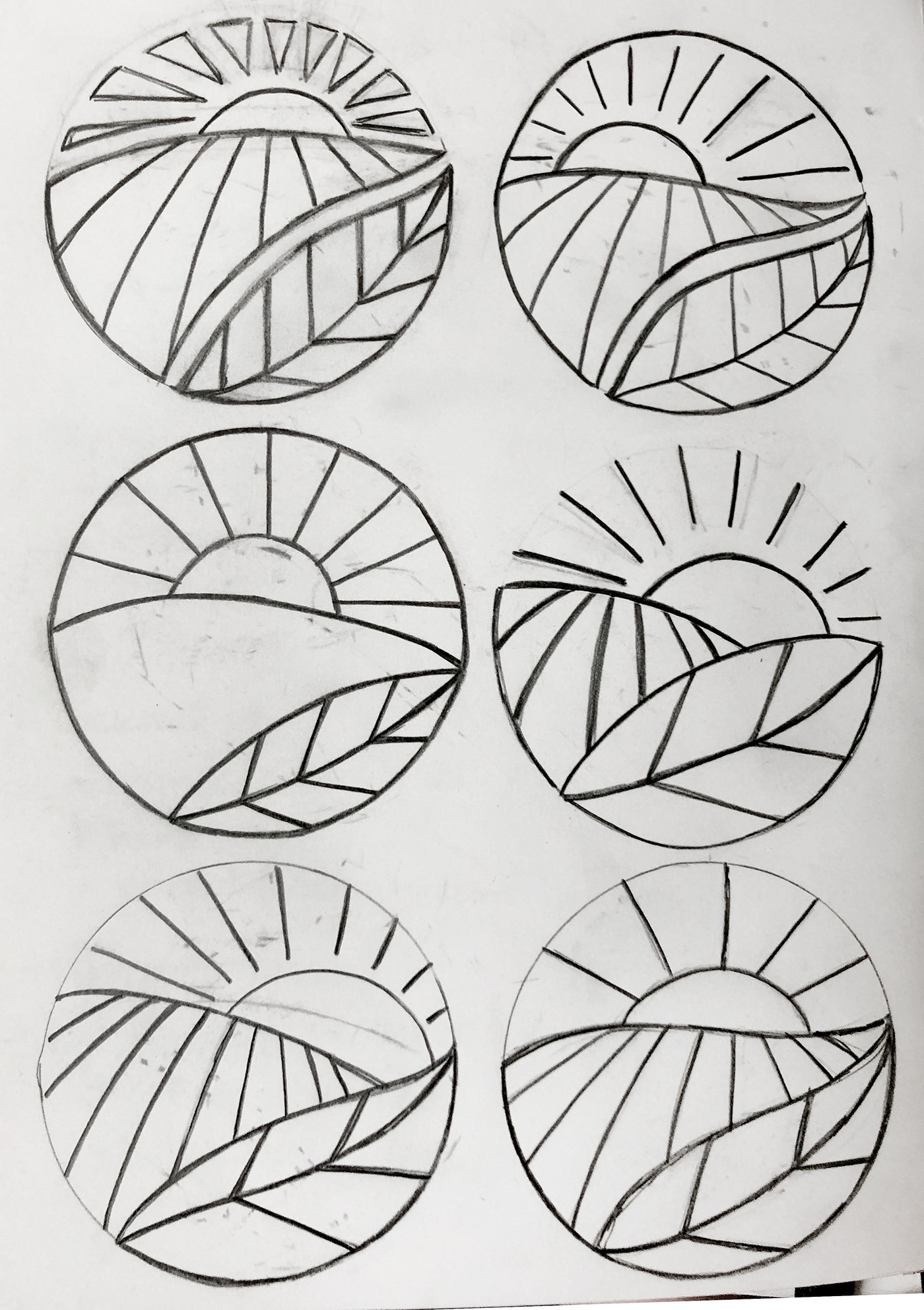
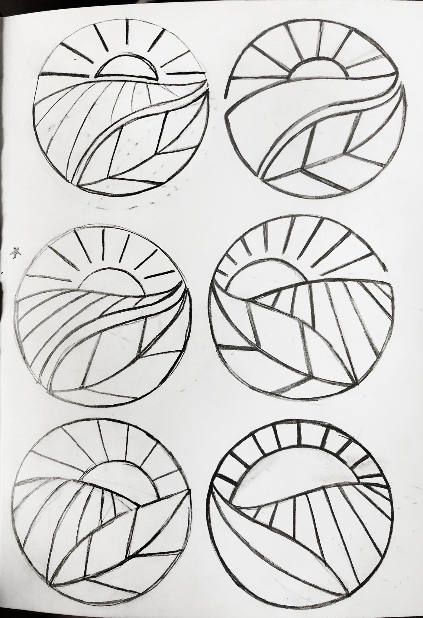
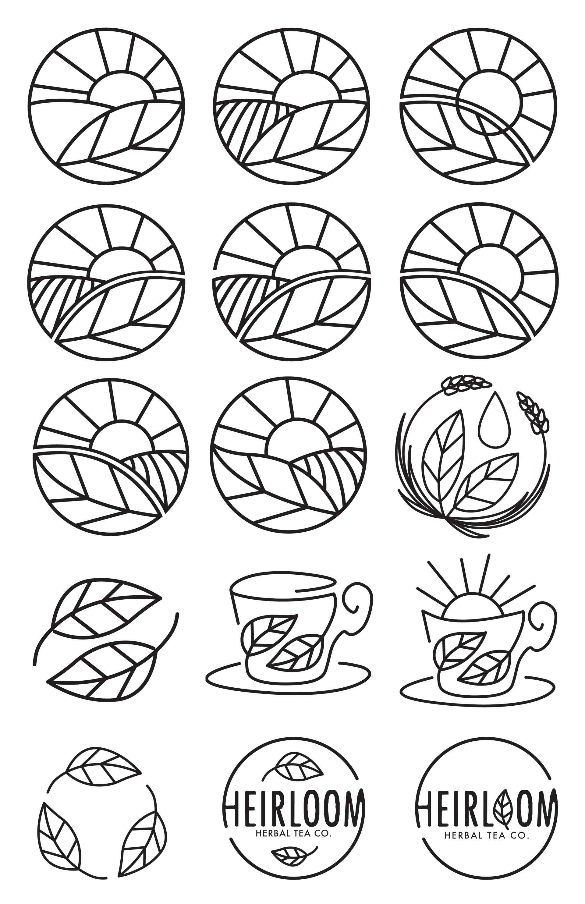
Before I had settled on this logo, I started with sketches. I tried to explore many different types of farm and Kentucky-related objects because of the importance of local/fresh produce used in the teas, as well as popular "natural" and eco-friendly symbols like leaves. see below some of my preliminary sketches and computer roughs:

S T A T I O N E R Y
p a c k a g I n g
To further develop my tea brand, Heirloom Herbal Tea, I created packaging for their flagship flavors of herbal tea. I ultimately chose to design rectangular boxes that would be printed on heavy stock paper and would enclose 20 individually-wrapped tea bags. This packaging was appropriate because the paper can be recycled and does not use any plastic, which enforces the brand's focus on sustainability.
W e b s I t e
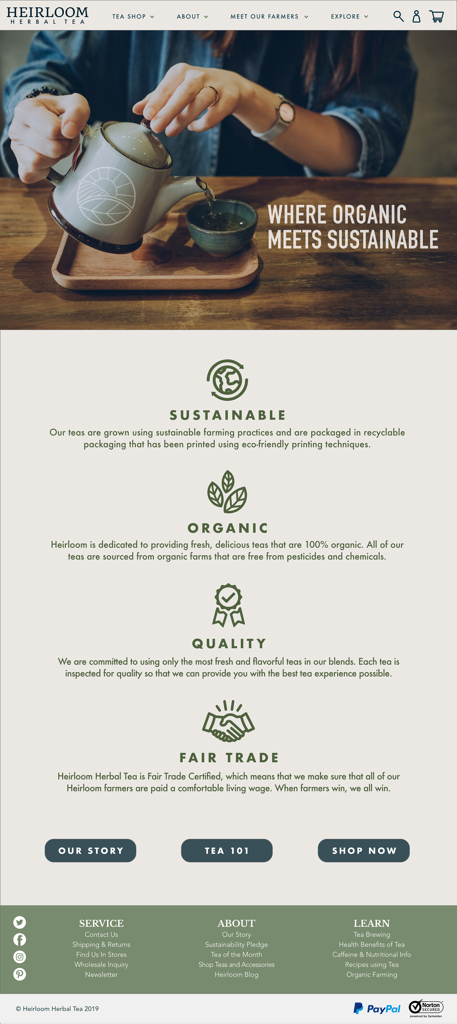
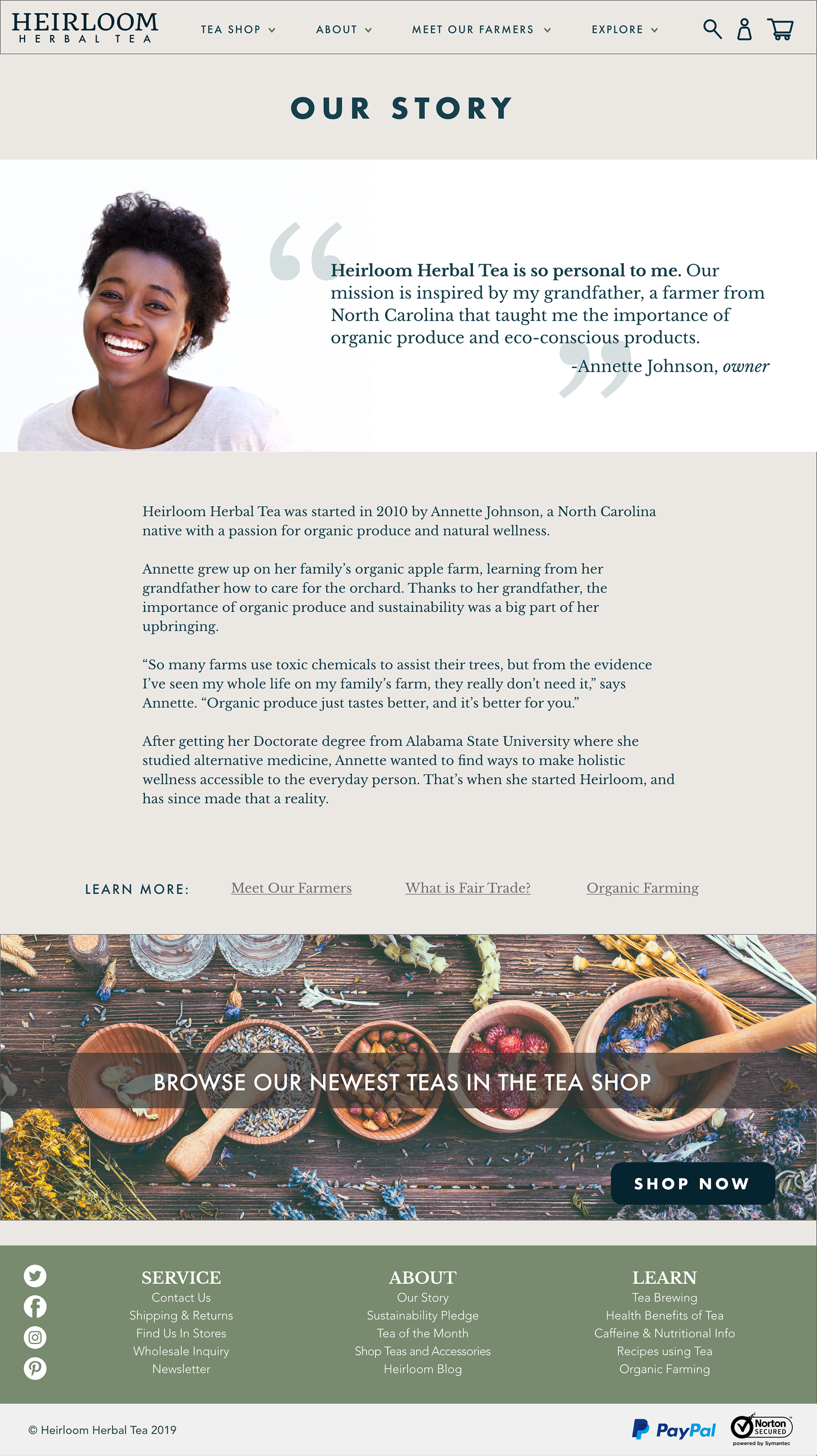
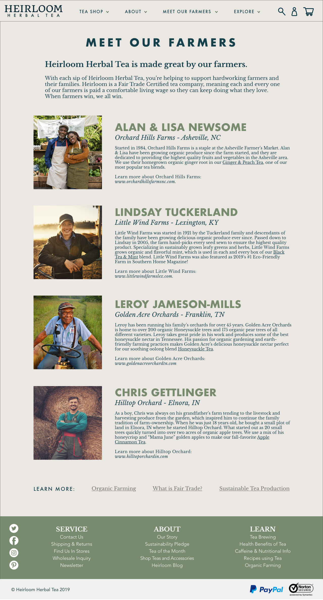
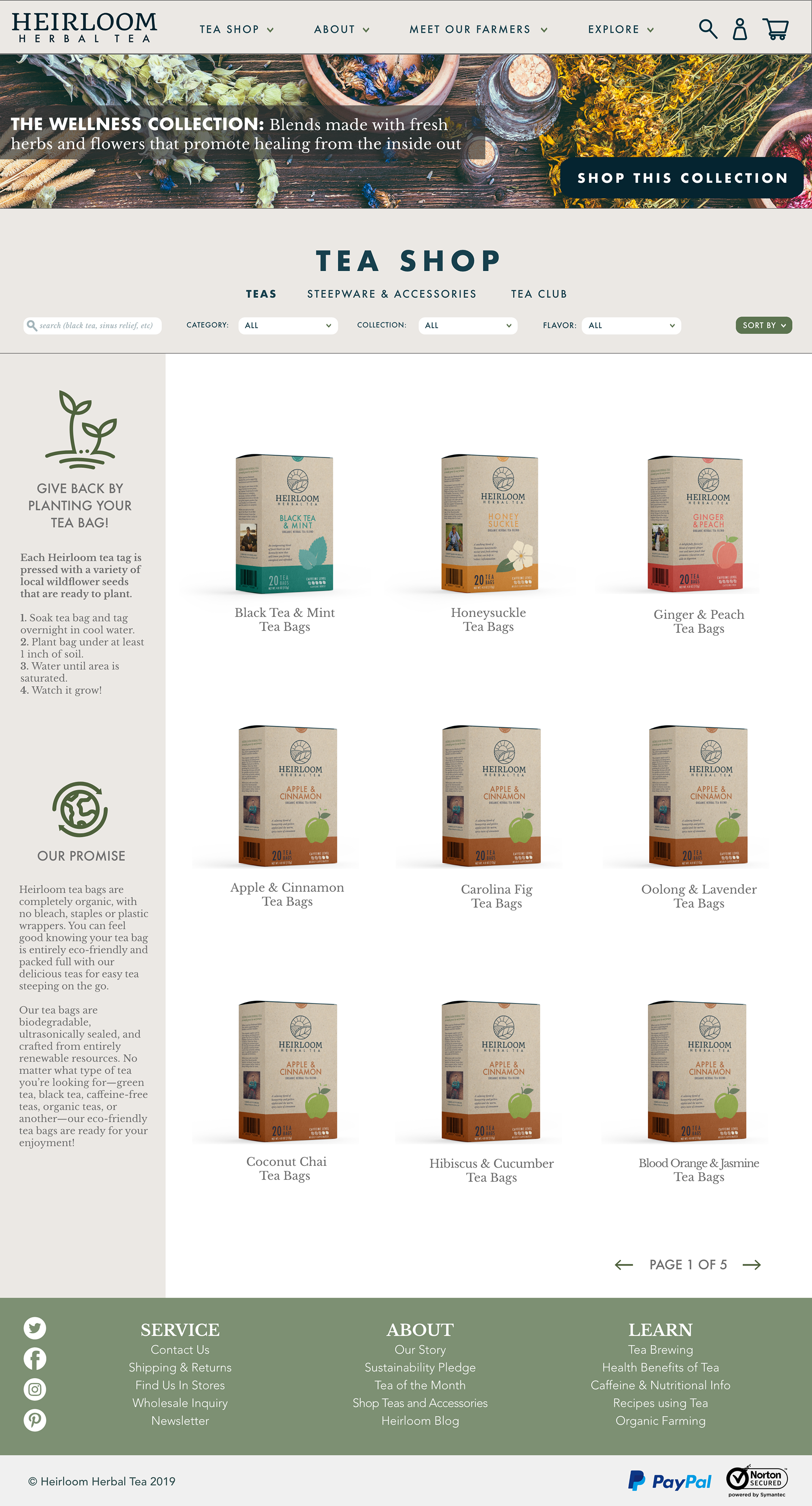
This project was to design a responsive Wordpress website for my fictional herbal tea brand, Heirloom Herbal Tea. The site needed to have three working pages and a mobile friendly site. My website was commerce-focused, but also showed information about the history of my brand as well as some blurbs on the farmers who grow the produce for the tea, a cornerstone of the fair-trade aspect of the brand.
B R A N D S T A N D A R D S G U I D E
Finally, I created a brand standards guide using all of the design elements I have created for the brand thus far. I made a detailed booklet to help oncoming designers or outside agencies adhere to the brand guidelines and therefore protect the integrity of the brand identity of Heirloom Herbal Tea. I created a brand moodboard, a breakdown of the logo, and detailed instructions on how to use the logo, colors, and typography and included some brand touch points to show a cohesive brand identity.
The primary goal for my brand standards booklet was to create a guide that was clear, concise, and enforced the brand identity, so I ultimately chose to go with a simple, clean design that would allow the reader to find and understand the information easily.
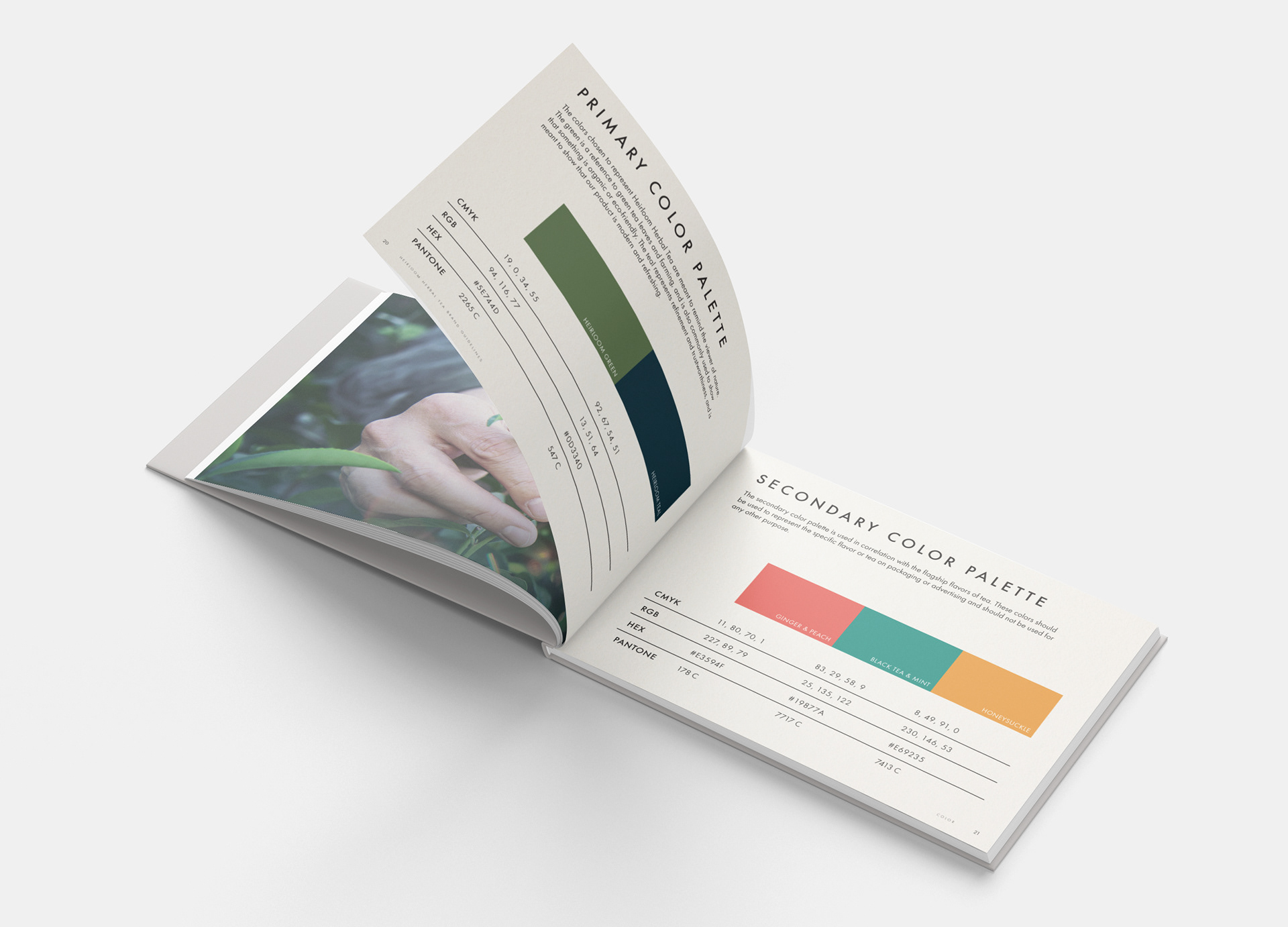
Below is a view of each of the spreads:
Each spread is printed with a rustic paper texture over the page, enforcing the classic/natural feel of the brand.
The colors used here reflect the primary colors of the brand as well as
the colors used on the packaging for the main flagship flavors.
the colors used on the packaging for the main flagship flavors.
B E H I N D T H E S C E N E S
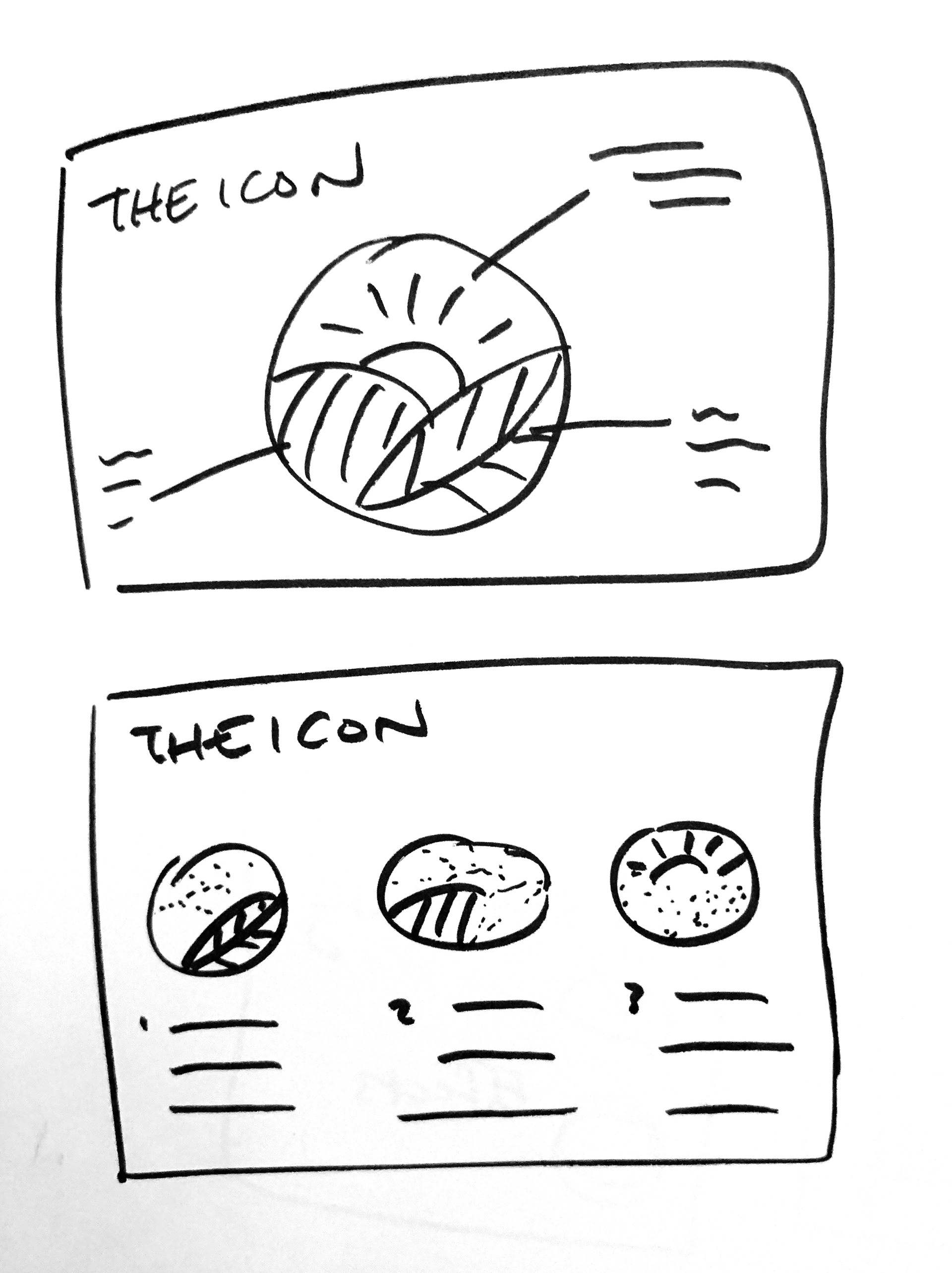
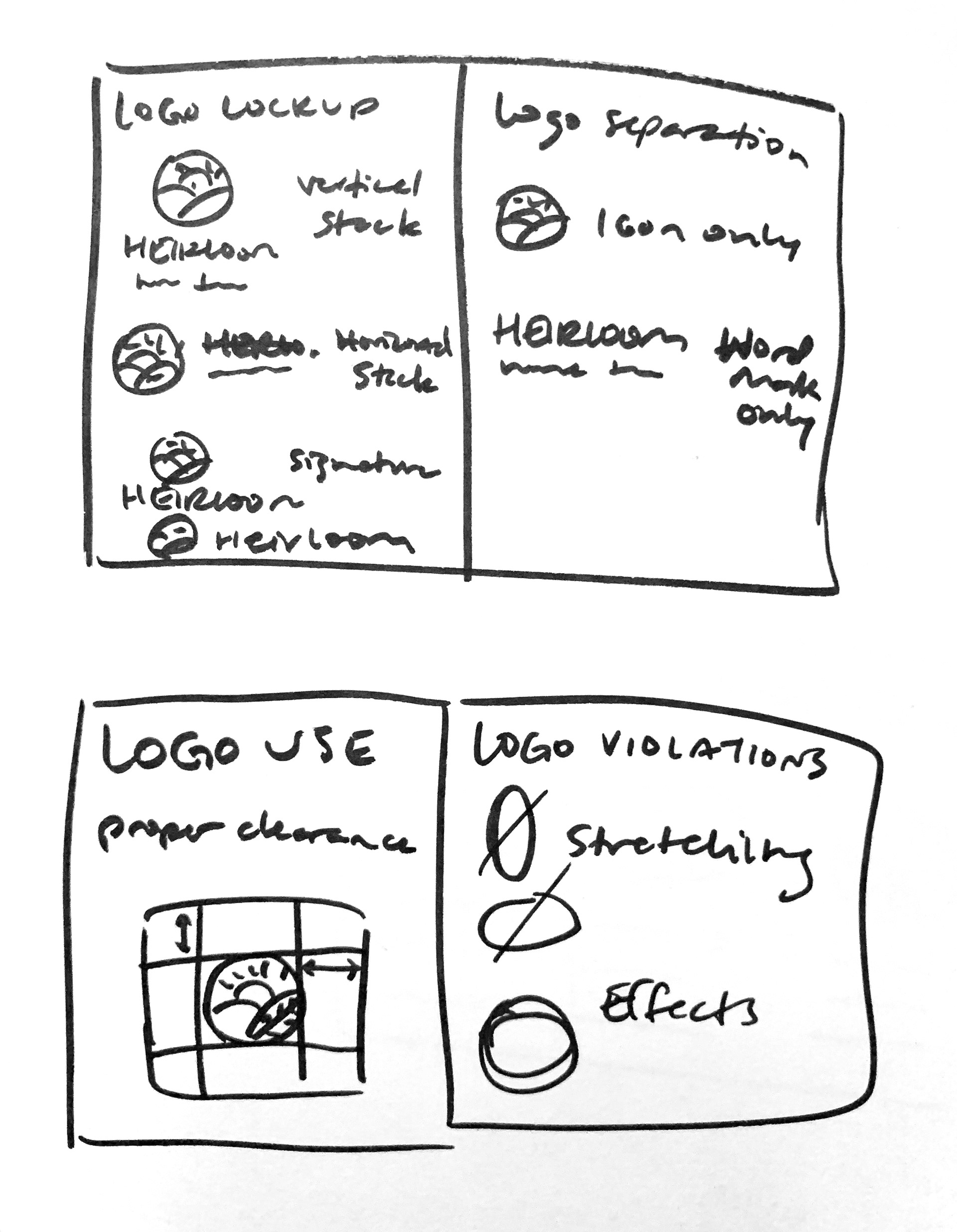
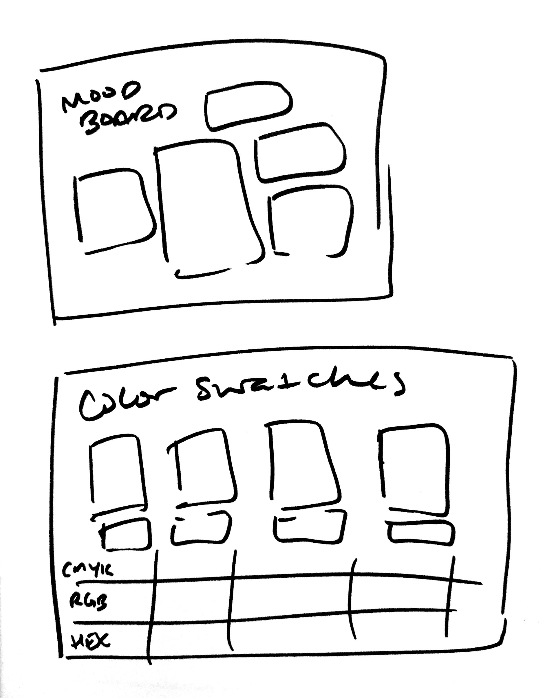
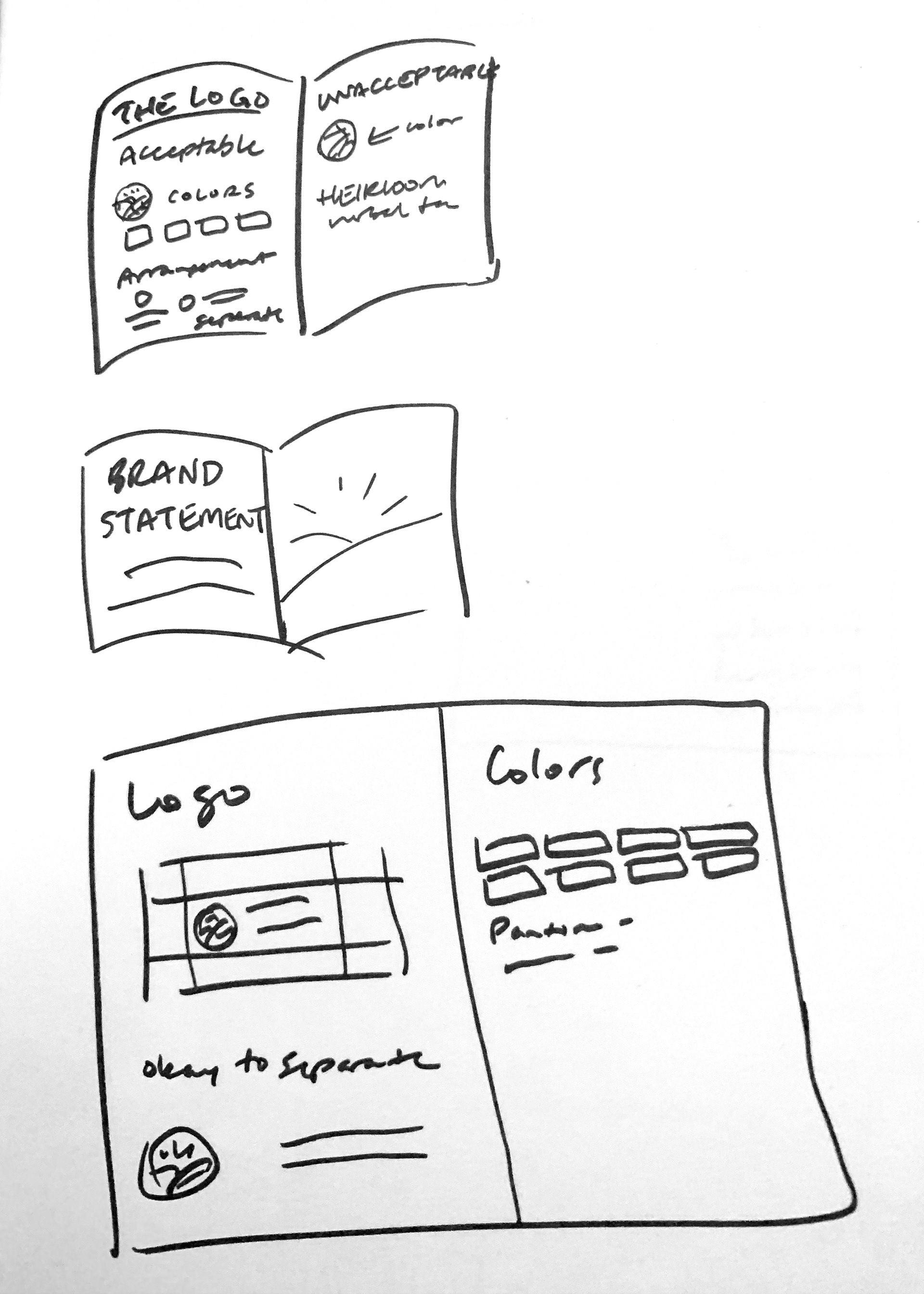
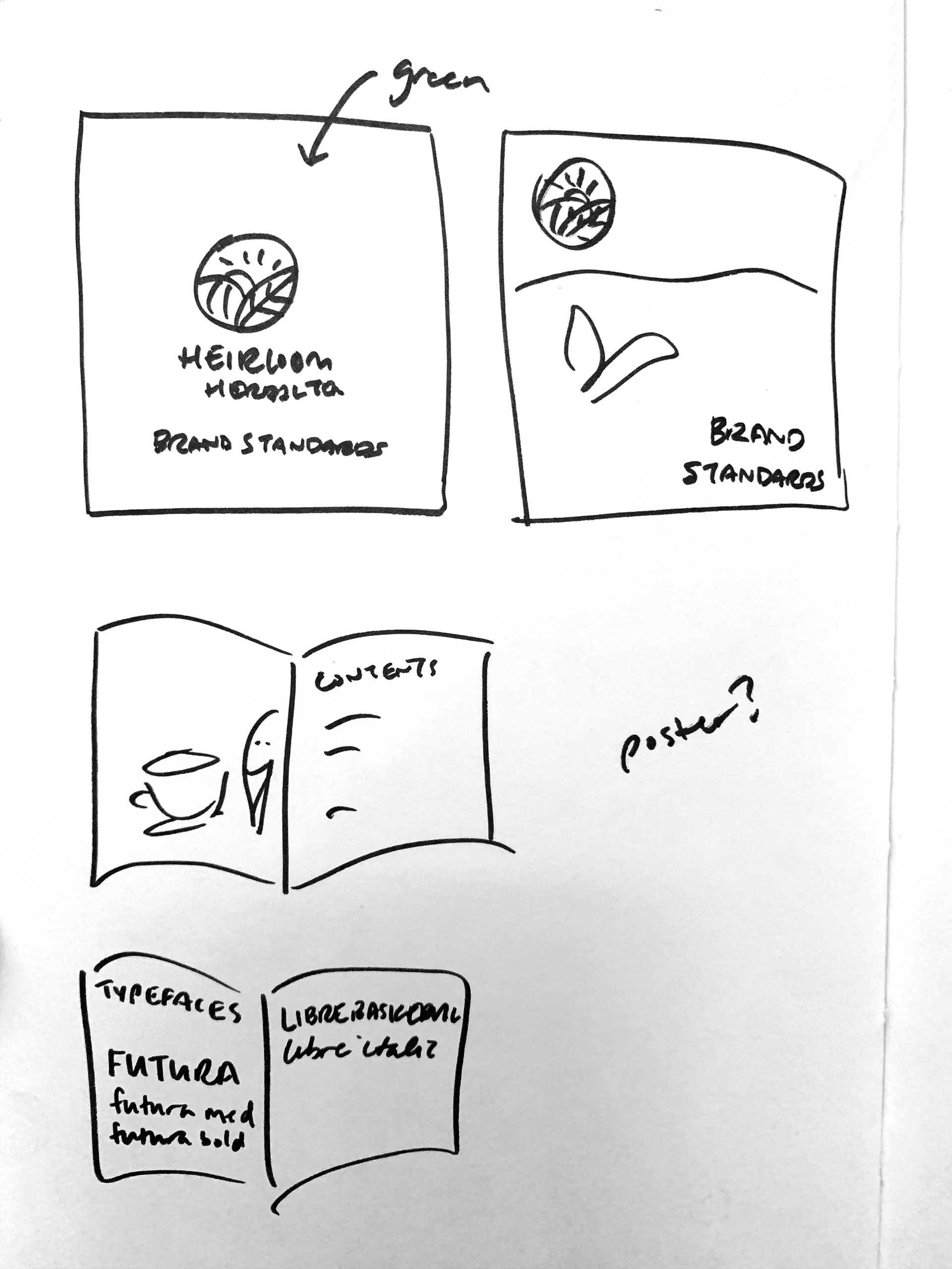
Before I created the final brand guide design, I used a series of sketches to determine what I wanted to include in the book and how I wanted to lay it out. See my preliminary sketches below:

