T H E L O G O
For this project, I developed a fictional restaurant based on artist Joan Miro. Because Joan Miro is from Catalonia, Spain, I chose to create a tapas restaurant called Cataluña (the Spanish spelling of his home town). Like many traditional Tapas restaurants, this tapas bar would serve a lot of seafood, so I opted to incorporate a fish into the logo. Because Miro included bright colors and thick black outlines in his art, I wanted to find a way to show those elements while still creating a logo that was ultimately modern in appearance. For my three-color version, I used red and yellow to reflect the colors used in Miro's work, which are also the colors in the Spanish flag.
The two color version and the black version:
T H E M E N U
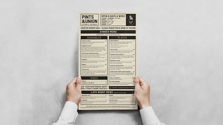
As the final part of my fictional tapas restaurant project, I created a menu. This menu is laser engraved onto wood that is approximately 1/8" thick. Because this restaurant is a higher-end casual place, I wanted this menu to show a balance between a modern aesthetic and a more playful, casual one. Because the restaurant wanted to use the original, Spanish names for the menu items, I included a short description of the dish underneath to entice restaurant-goers.
